Chapter 5 Modeling the migratory network
5.1 Input data
As described in the previous section the data required are:
- Abundance
- Migratory connectivity
The abundance data need to be in the following format, with node IDs (same names as in the assignment file) in the first column and abundance values in the second column.
| Population | Relative_abundance |
|---|---|
| BR | 2403 |
| ST | 9419 |
| MP | 19011 |
| NT | 72147 |
| WB | 26080 |
| HCA | 326 |
| AONU | 1139 |
| LCA | 2802 |
| ALM | 3169 |
| CAR | 7987 |
For the migratory connectivity data, the input data needs to correspond to the following format:
| Breeding | CAR | AONU | ALM | LCA | HCA |
|---|---|---|---|---|---|
| BR | 1 | 0 | 0 | 0 | 0 |
| MP | 0 | 9 | 0 | 0 | 0 |
| NT | 58 | 0 | 3 | 1 | 0 |
| ST | 9 | 12 | 0 | 1 | 4 |
| WB | 1 | 0 | 20 | 15 | 1 |
If you skipped it, see the previous Step 2) Abundance and migratory connectivity data section for specific details on the input data formatting!
For the following functions, we specify the order of the nodes we are using for the model. Here, we are just ordering nodes geographically by longitude to facilitate straightforward interpretation of the output.
brnode_names <- c("WB", "BR", "NT", "ST", "MP")
nbnode_names <- c("ALM", "LCA", "HCA", "CAR", "AONU")
For the American Redstart migratory network, we use model = 1 from mignette which specifies that nonbreeding nodes are “encountered” and breeding nodes are “recovered” (i.e., inferred). This output saves the model as amre.genetic.model_1.txt. Below we specify parallel = TRUE to run MCMC on multiple cores and use the remaining defaults described previously CHANGE LINK. This step is computationally intensive and takes ~2 minutes to run on a 2023 MacBook Pro with an Apple M2 Pro chip.
network_model <- run_network_model(abundance = amre_abundance,
                           nb2br_assign = amre_assign,
                           brnode_names = brnode_names,
                           nbnode_names = nbnode_names,
                           model = "BR", base_filename = "amre.genetic",
                           parallel = TRUE)
The run_network_model() function outputs a list object with four components. The first component of the output, [[“conn”]], is an R tibble object of the mean connectivity estimated between nodes (Table 1). These values are interpreted as the proportion of individuals the global population that migrate between the corresponding populations, as such all of the values in the network matrix sum to one. The second component, [[“jags_out”]], is the full output from jagsUI::autojags() provided as a list object, which contains important model information such as parameter estimates and credible intervals, model specifications, and goodness of fit. The final two components, [[“brnode_names”]] and [[“nbnode_names”]], store the node names corresponding to the rows and columns, respectively, of the connectivity matrix.
| Breeding | ALM | LCA | HCA | CAR | AONU |
|---|---|---|---|---|---|
| WB | 0.14422 | 0.13388 | 0.01340 | 0.00508 | 0.00002 |
| BR | 0.00014 | 0.00019 | 0.00009 | 0.01655 | 0.00006 |
| NT | 0.05010 | 0.02698 | 0.00011 | 0.38497 | 0.00005 |
| ST | 0.00002 | 0.01126 | 0.03642 | 0.02810 | 0.06308 |
| MP | 0.00011 | 0.00020 | 0.00023 | 0.00002 | 0.08470 |
The second component is the full output from *jagsUI* autojags() and is accessed by network_model$jags_out.
We plot the migratory network with the provided mignette functions net_create() and net_draw(). We set connected_tol = 0.01 which plots only the edges with connectivity values of greater than 0.01. We also demonstrate below how to change parameters such as the colors and the node and edge scale size.
amre_net <- net_create(network_model = network_model,
                       margin = 0.05)
#set the display size range for nodes (min and max), default 1-10
amre_net$display_par$node_size_scale <- c(8,25)
#set the display size range for edges (min and max), default 1-10
amre_net$display_par$edge_size_scale <- c(1,5)
# change colors
amre_net$display_par$brnode_colors <- c("#009e73", "#cc79a7", "#56b4e9", "#e69f00", "#7979ff")
amre_net$display_par$nbnode_colors <- "grey80"

net_draw(amre_net)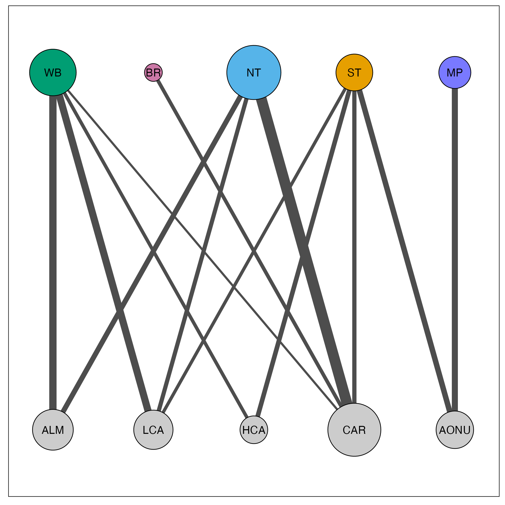
In this visualization, node size corresponds to the amount of connectivity with that population and edge size corresponds to the amount of connectivity between the populations. Breeding populations are in the top row, for which we provided custom colors, and nonbreeding populations are in the bottom row.
Now you have a migratory network! Check out the visualization supplement for additional ideas on plotting the network.