Chapter 6 Supplement: Visualizations
6.1 Alluvial plot
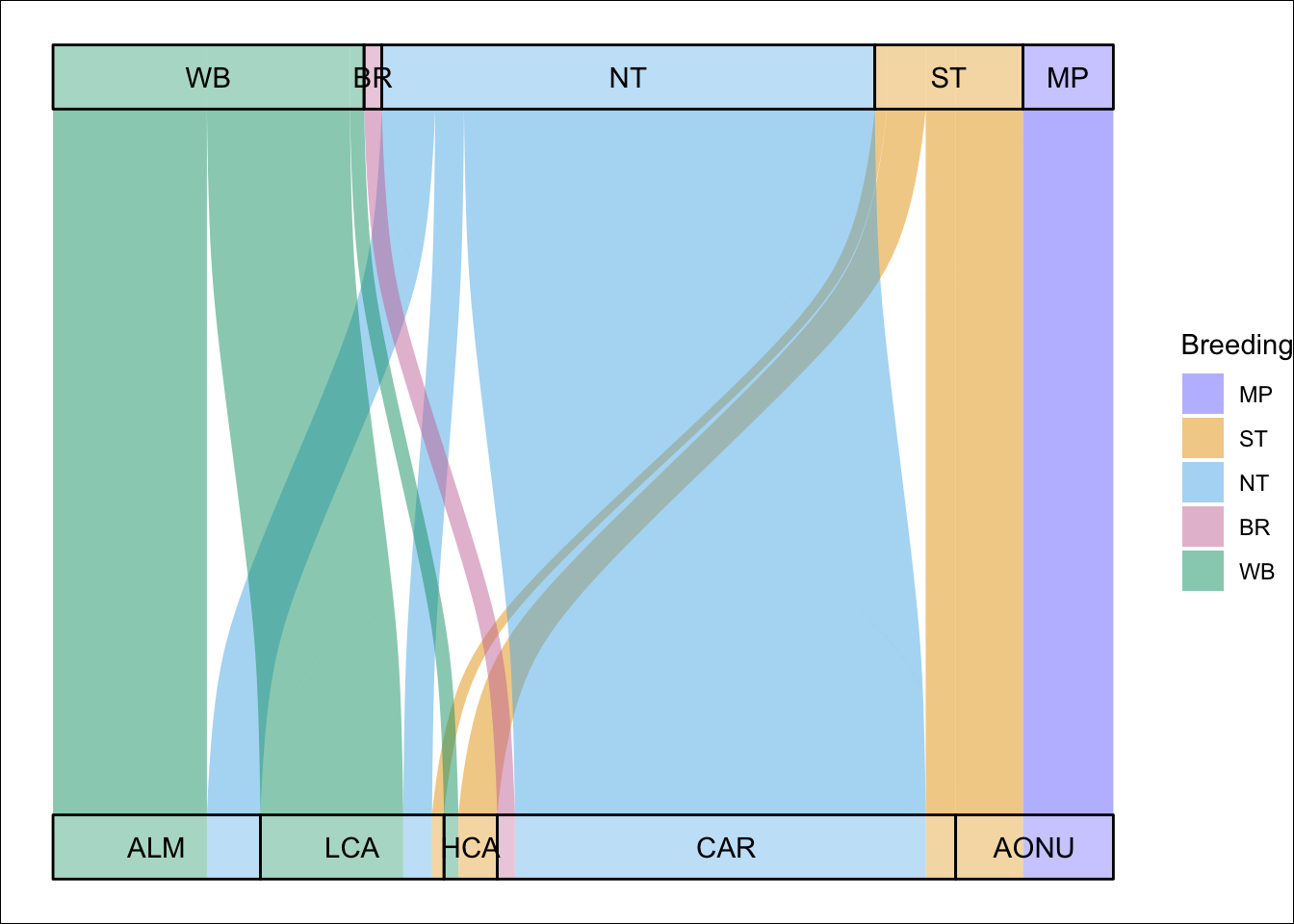
Ok, we’ll toss out another way to visualize these networks using the ggalluvial package because it’s really fun. In this alluvial plot, the width of the connections correspond to the network model connectivity output, thus correspond to the proportion of the global species abundance that use that migratory network. The bars on the top row are the breeding nodes scaled by abundance and the bottom row are the nonbreeding nodes scaled by abundance.
library(tidyverse)
library(mignette)
library(ggalluvial)

brnode_names <- c("WB", "BR", "NT", "ST", "MP")
nbnode_names <- c("ALM", "LCA", "HCA", "CAR", "AONU")

cluster_colors <-  c(
  `ST` = "#e69f00", # orange/Southern Temperate
  `BR` = "#cc79a7", # pink/Basin Rockies (BR)
  `NT` = "#56b4e9", # light blue/Northern Temperate (NT)
  `WB` = "#009e73", # green/Western Boreal (WB)
  `MP` = "#7979ff" # dark blue/Maritime Provinces (MP)
)

amre_conn_df <- mignette::amre_conn %>%
  pivot_longer(cols = ALM:AONU, names_to = "Nonbreeding", values_to = "Connectivity") %>%
  mutate(Connectivity = ifelse(Connectivity < 0.01, 0, Connectivity)) %>%
  mutate(Breeding = factor(Breeding, levels = rev(brnode_names)),
         Nonbreeding = factor(Nonbreeding, levels = rev(nbnode_names)))

p.alluvial <- ggplot(amre_conn_df,
       aes(y = Connectivity, axis1 = Nonbreeding, axis2 = Breeding)) +
  geom_alluvium(aes(fill = Breeding), width = 1/12) +
  scale_fill_manual(values = cluster_colors) +
  geom_stratum(alpha = 0.25, width = 1/12) +
  geom_text(stat = "stratum", aes(label = after_stat(stratum))) +
  scale_x_discrete(limits = c("Nonbreeding", "Breeding"),
                   expand = c(0.05, 0.05)) +
  coord_flip() +
  theme_void() +
  theme(plot.background = element_rect(fill = "white"))

p.alluvial